

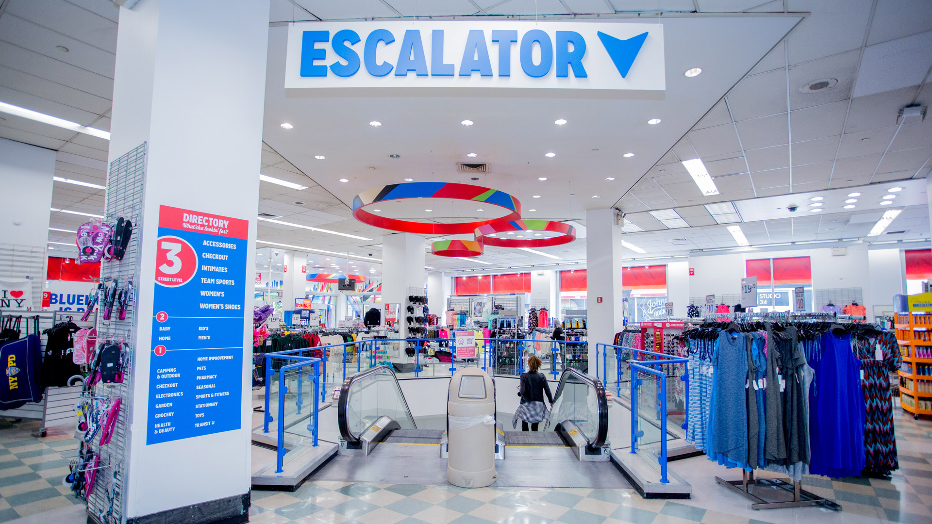
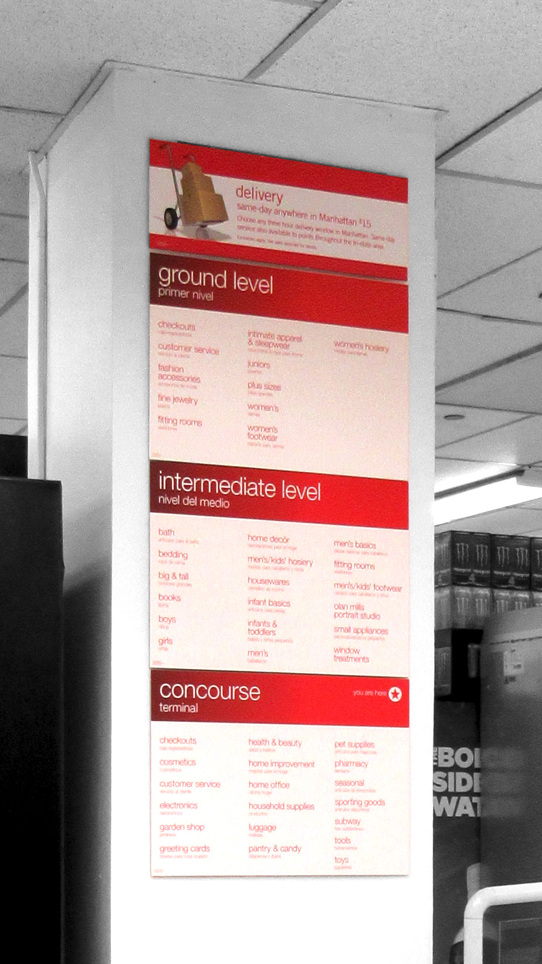
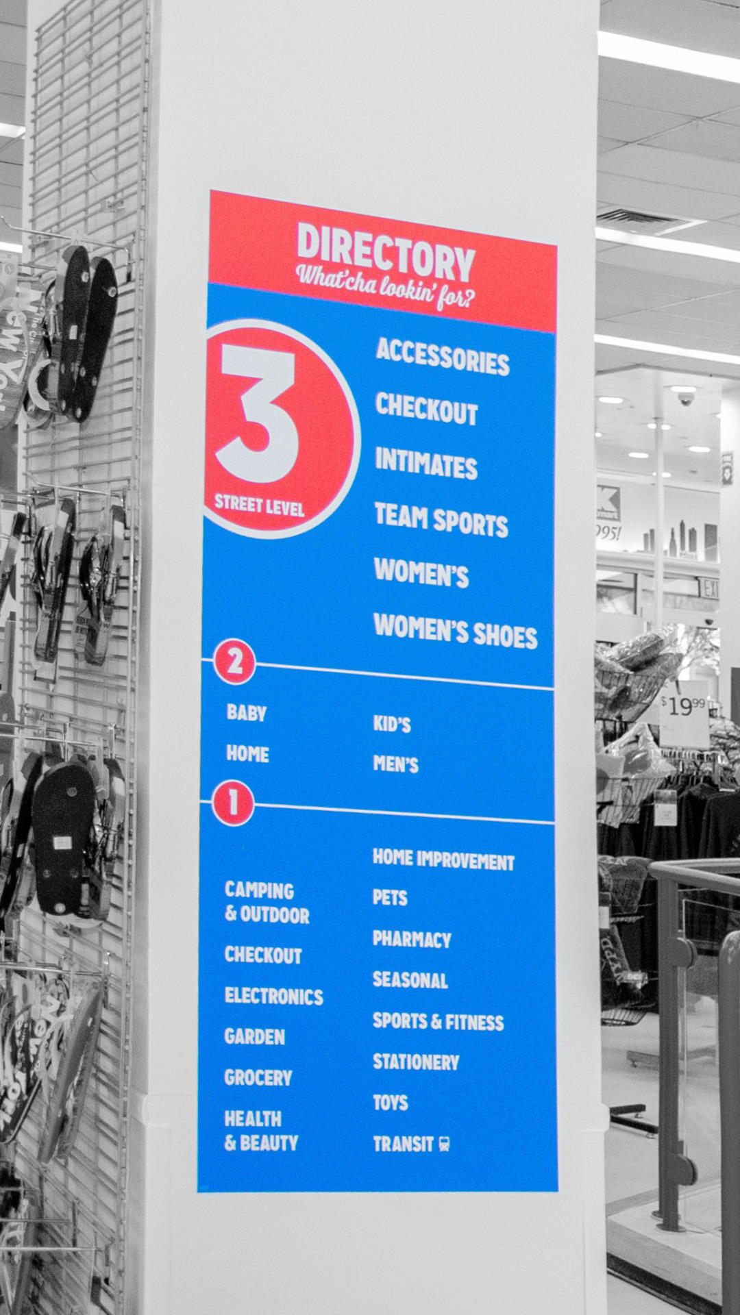
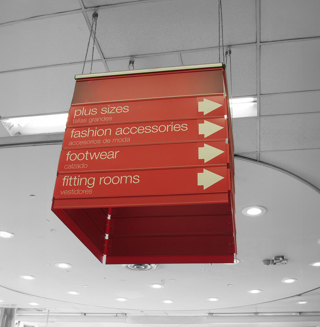
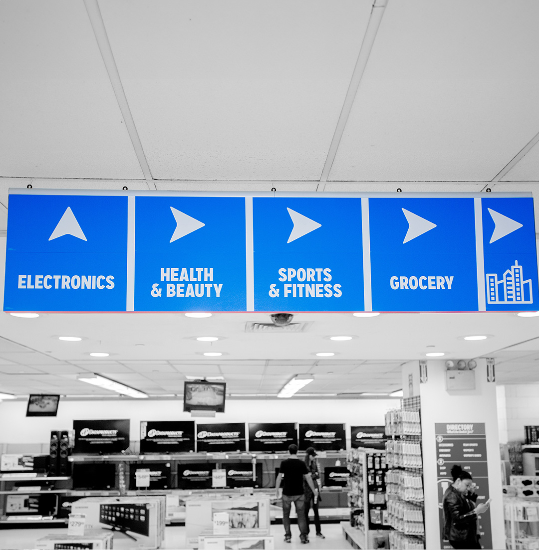
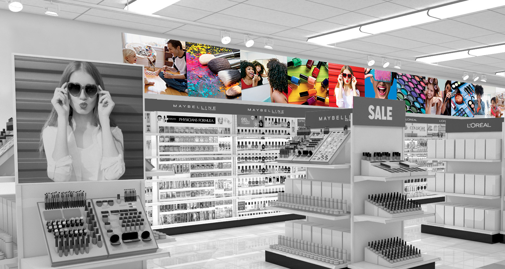
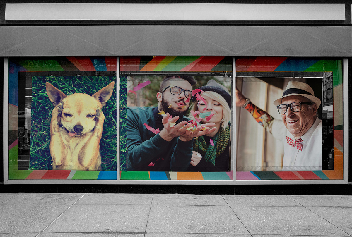
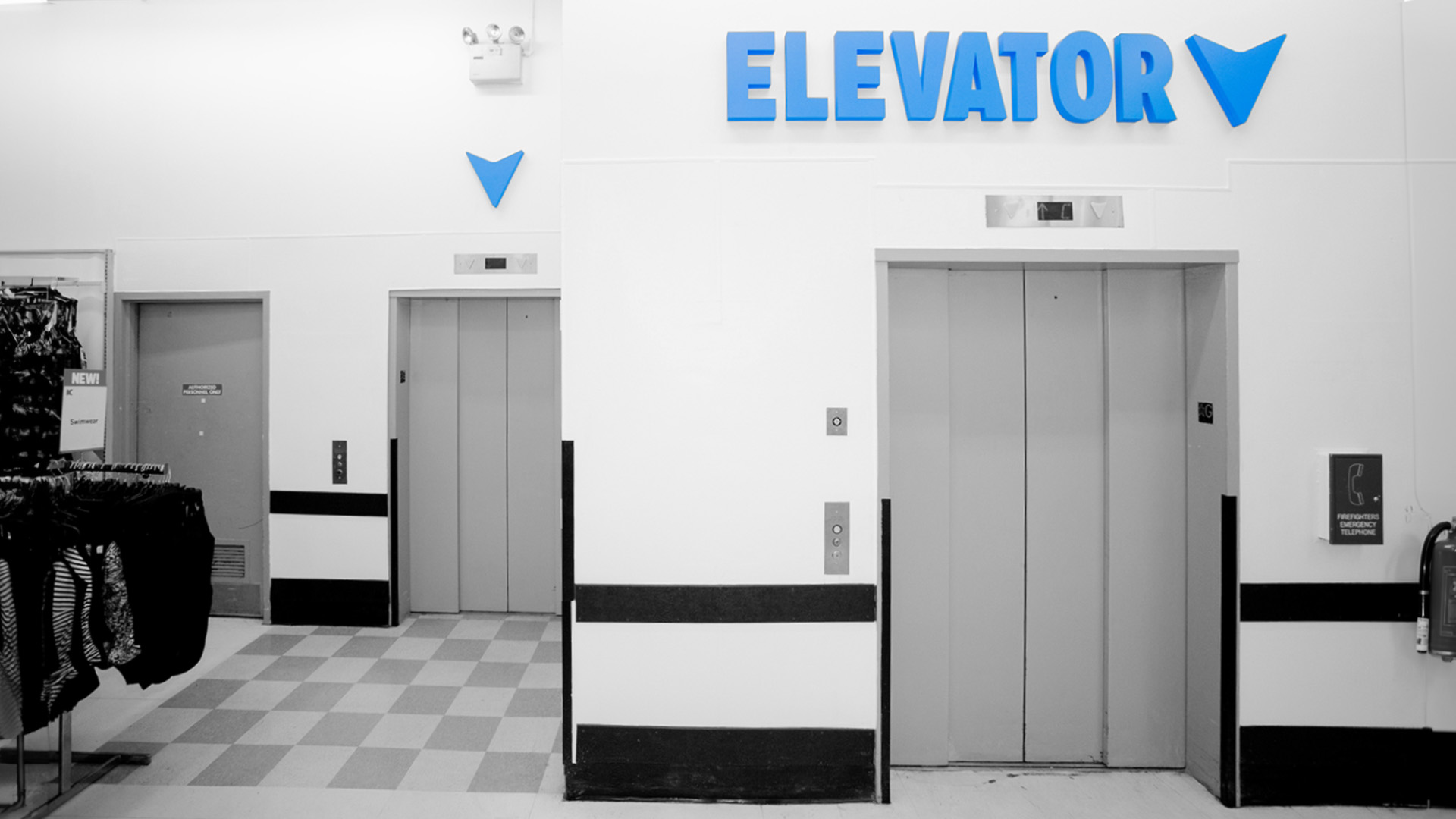
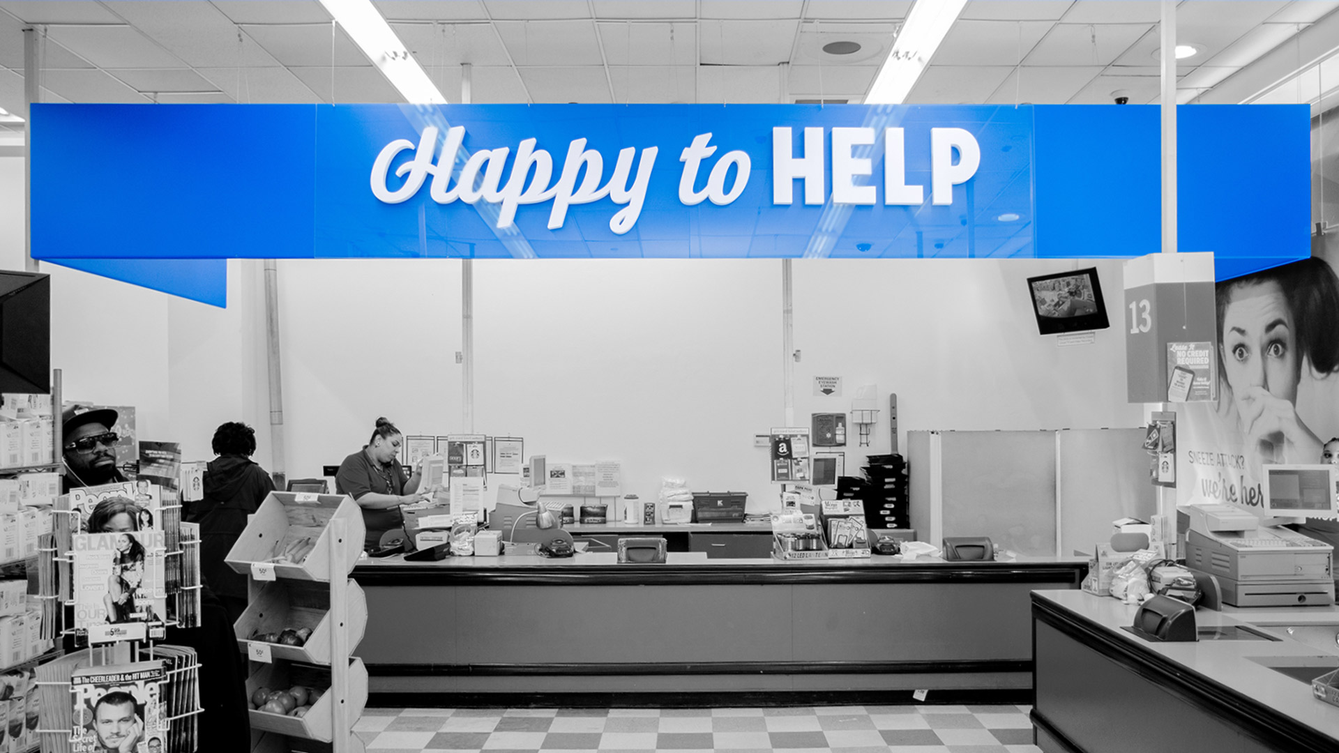
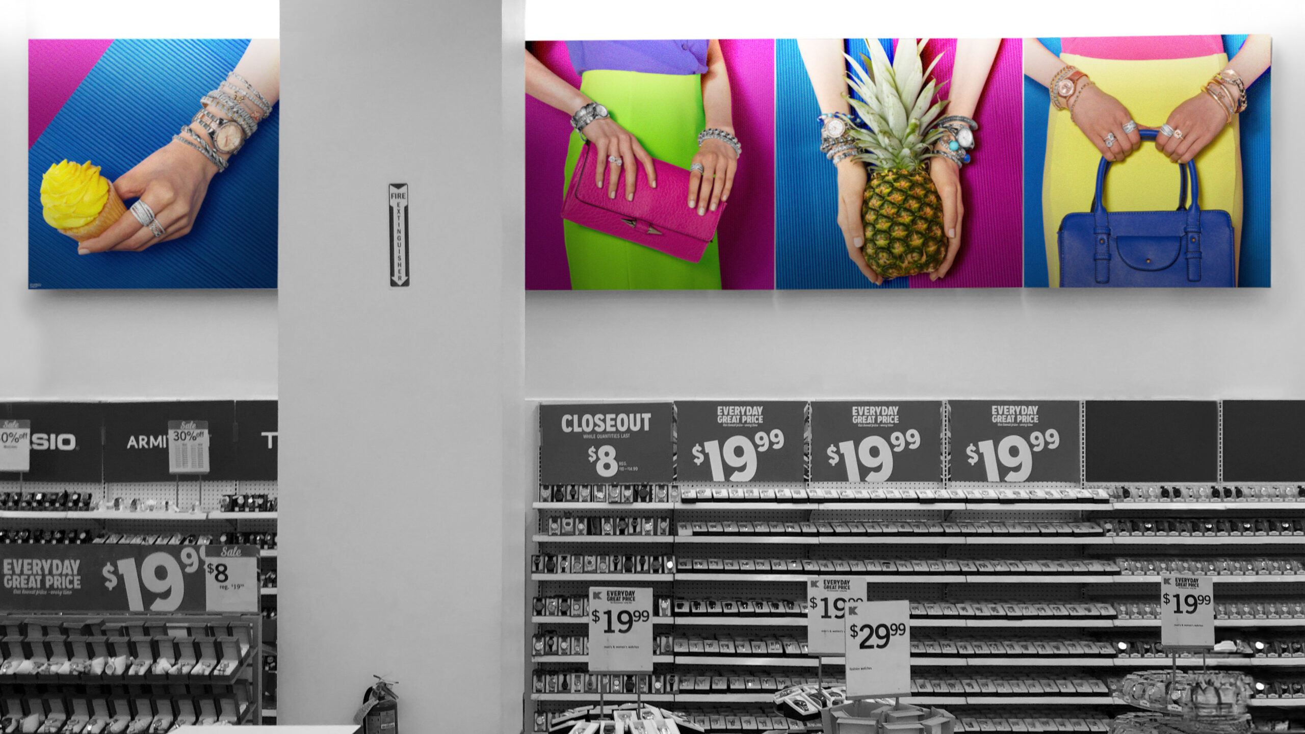
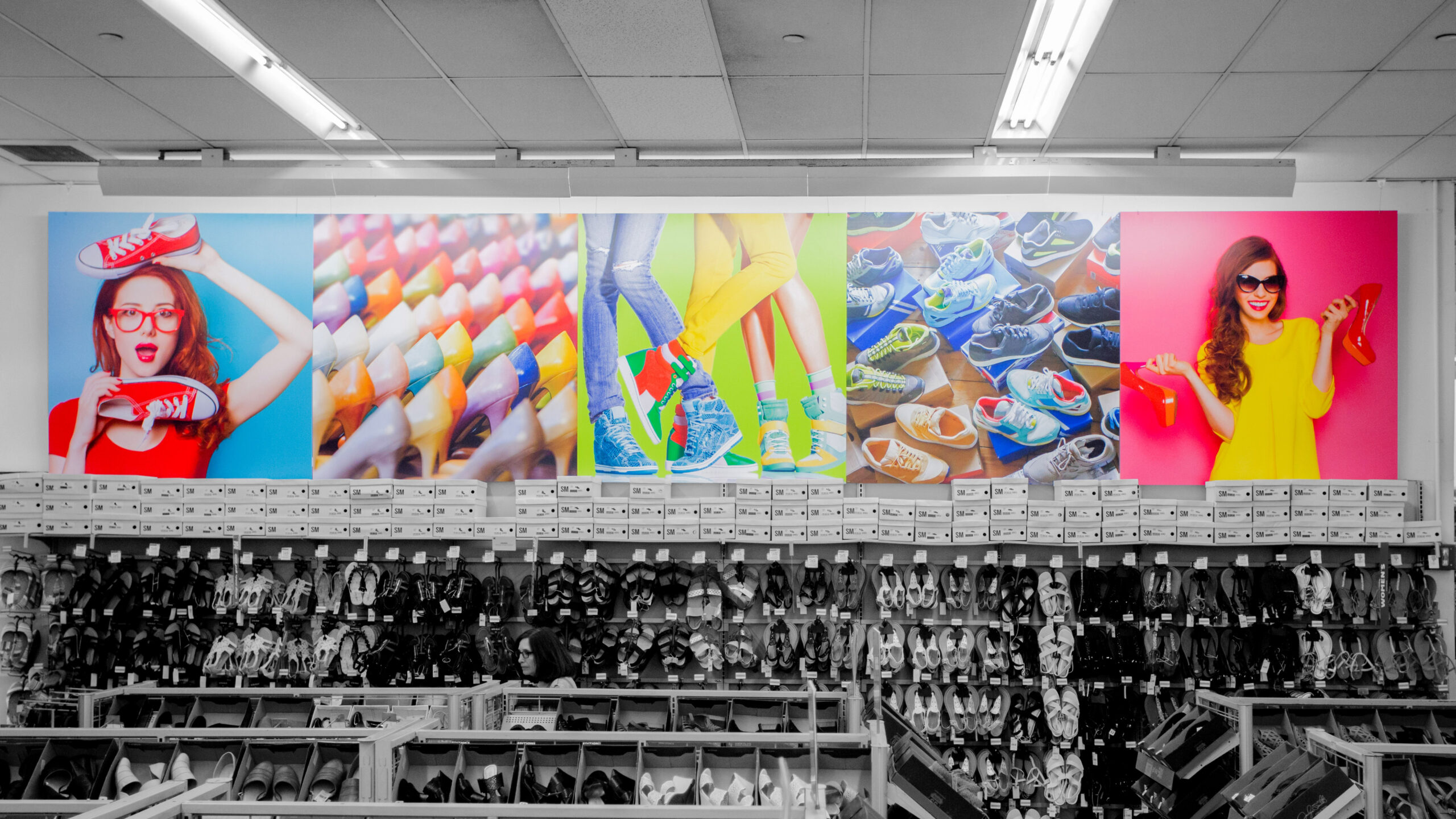
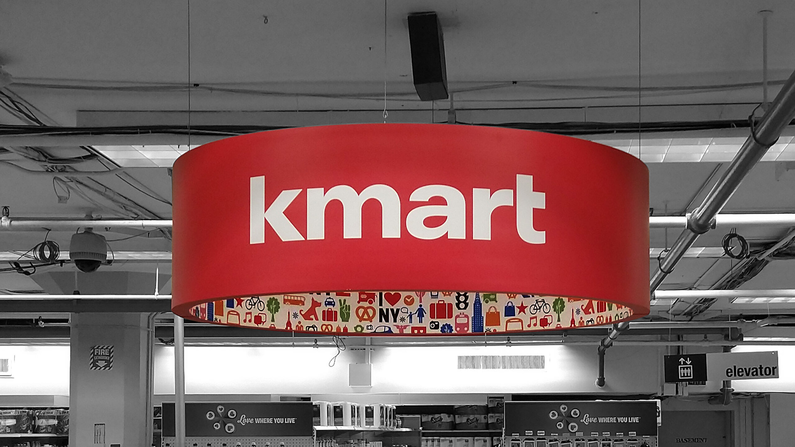
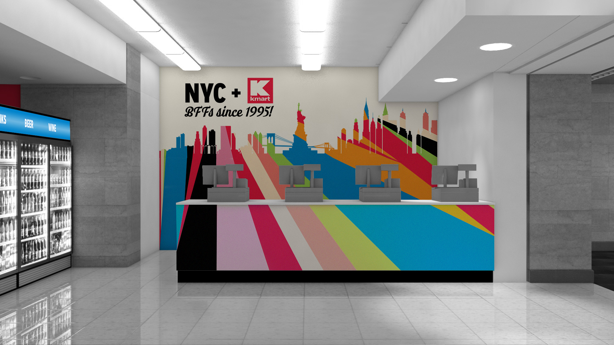
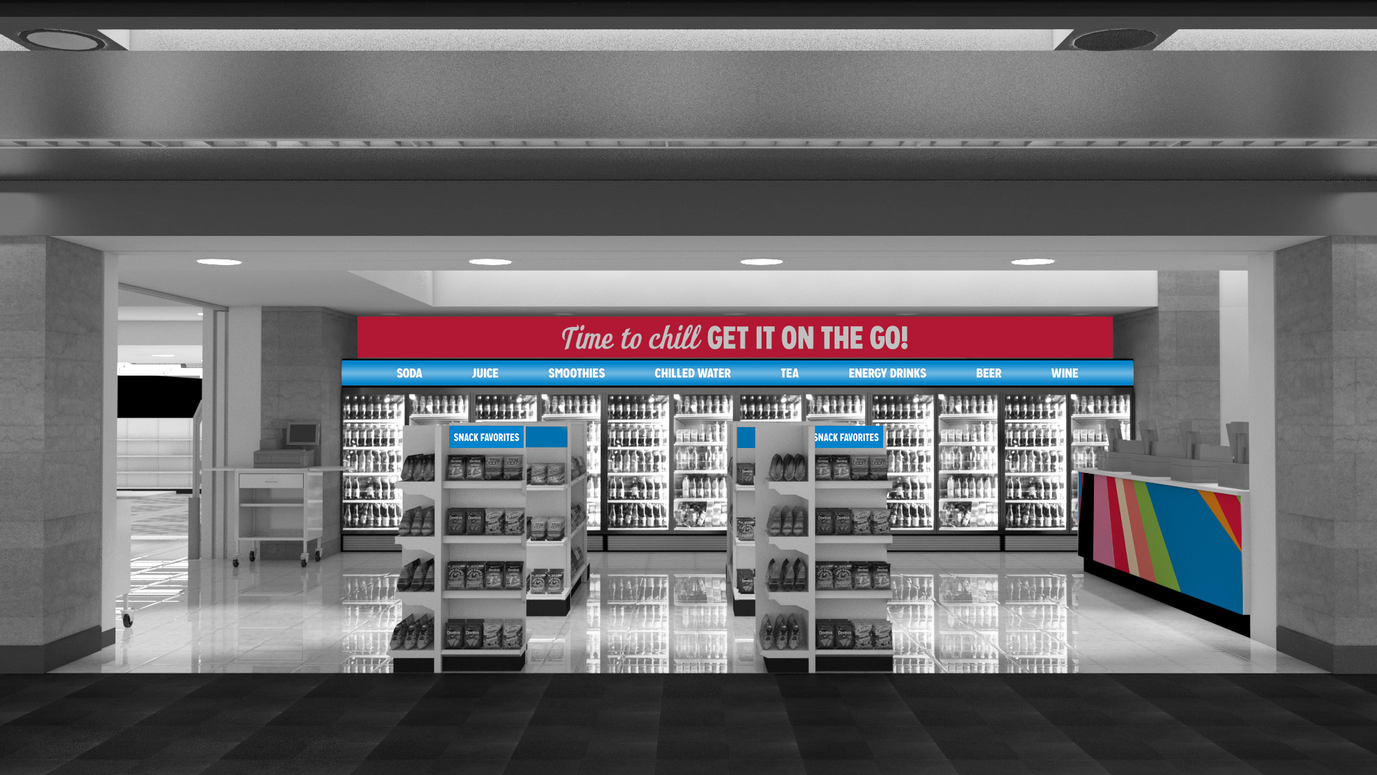
Throughout 2017 and 2018 the New York Penn Station, Astor Place and Brooklyn Sears stores received makeovers. I was responsible for creating one-of-a-kind Kmarts with a New York vibe. The look and feel was strongly rooted in the updated brand style that was established in 2016. Kmart was dedicated to "Making Shopping Fun Again". This theme was infused throughout the store refreshes through bright bold colors, bold in-your-face photography, quirky headlines, and customer-friendly navigation solutions. Each of the stores had their own way to stand out from the next by customizing certain elements to its geographic locations.
My work did not just end at the computer – my role was heavily involved from the ground up with each of these stores. I was involved in material selections, graphic applications, fixture signing, photography selection and retouching direction.
Concept, Design & Direction – Jenna West
Copy – Nancy Ahnell
Project Director – Heather Kennedy
Project Manager – Brittany Kelley
Signing Manager – Irene Chernyakovsky
3D Render Specialist – Angie Bertlesman
Production – Matt Goodman
Concept, Design & Direction – Jenna West
Copy – Nancy Ahnell
Project Director – Heather Kennedy
Project Manager – Brittany Kelley
Signing Manager – Irene Chernyakovsky
3D Render Specialist – Angie Bertlesman
Production – Matt Goodman

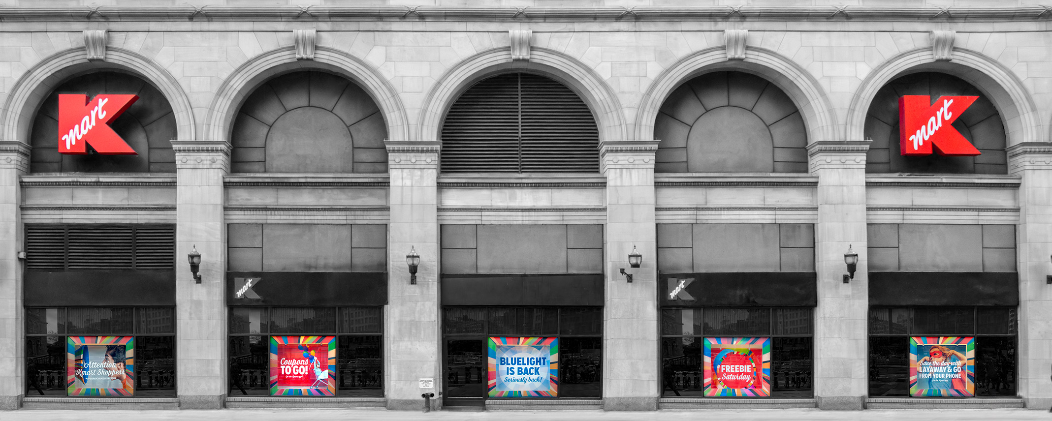
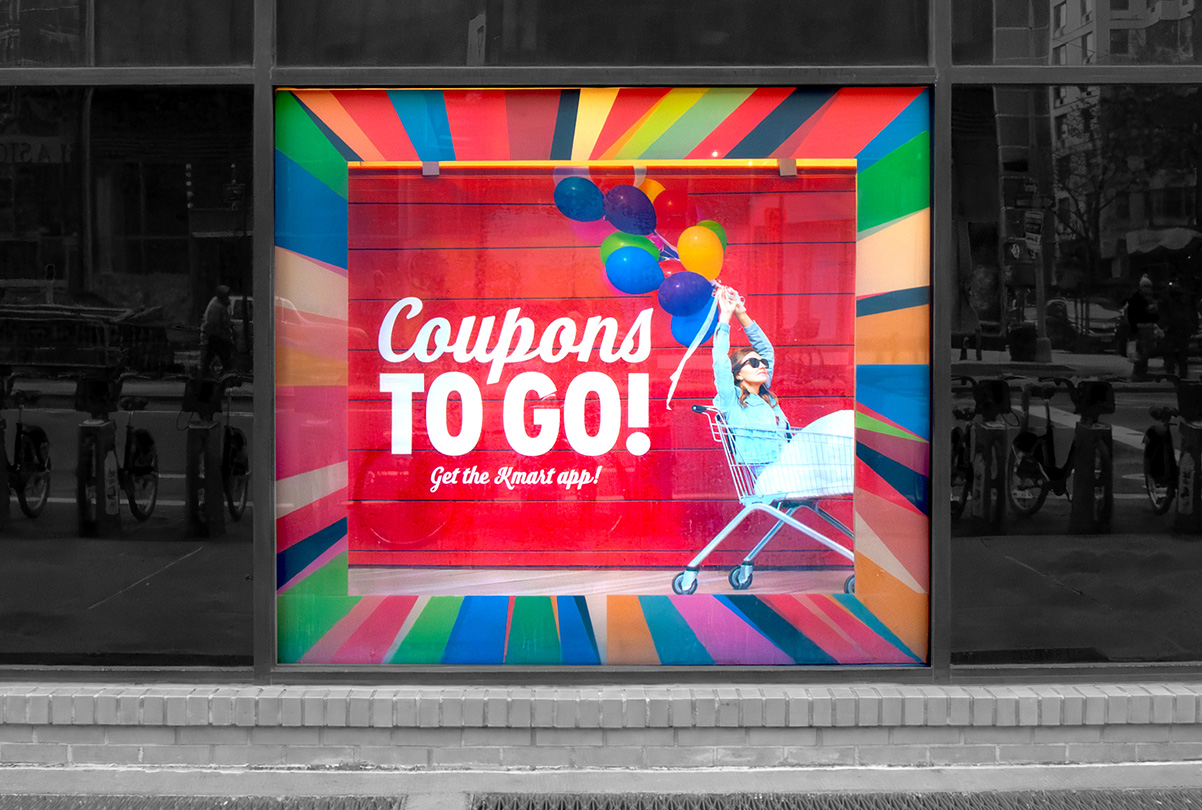
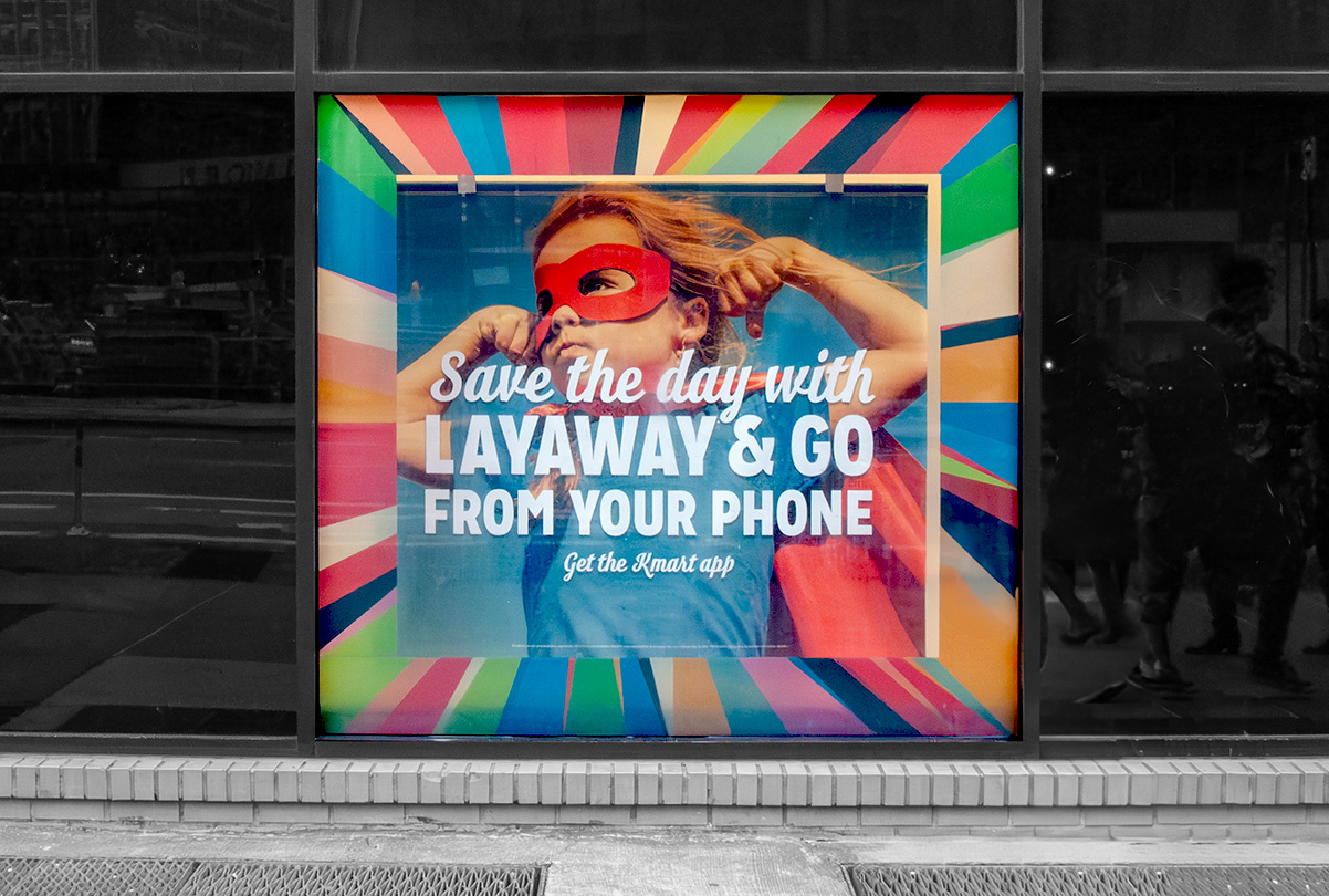
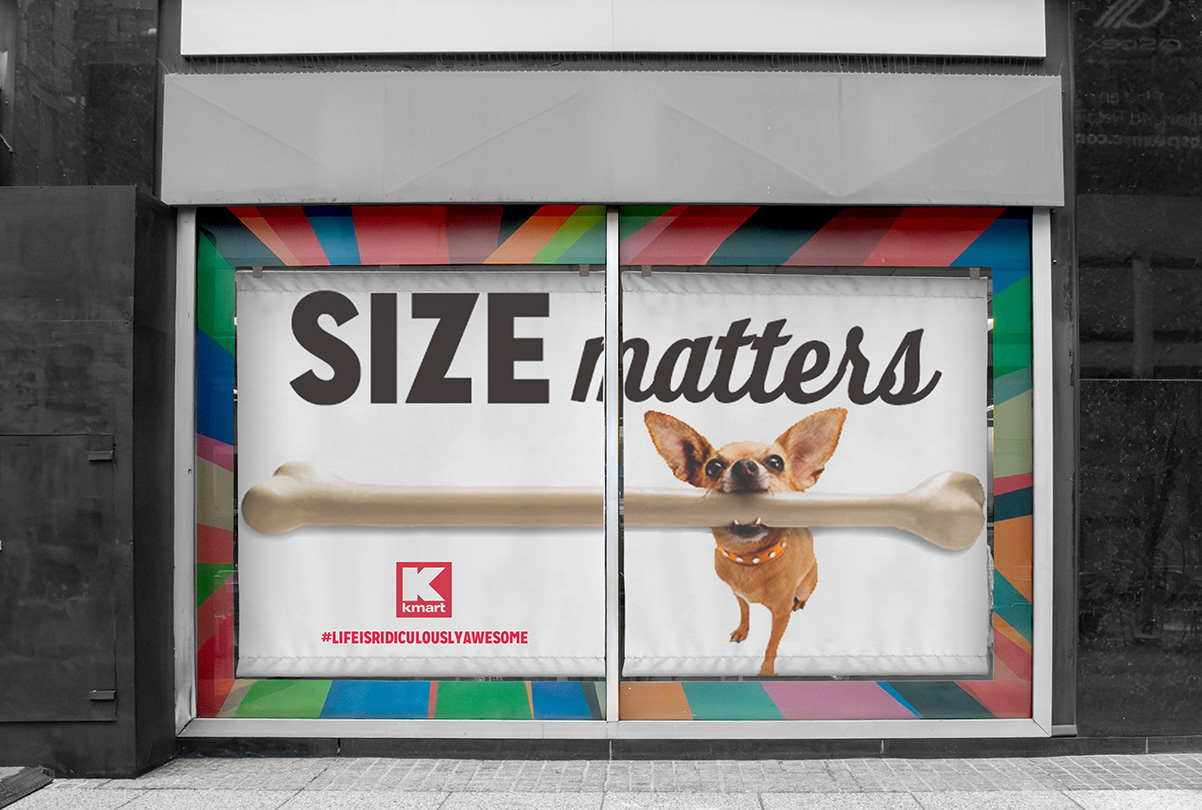
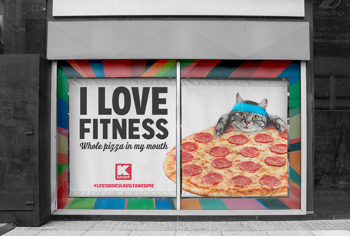
The New York City stores had ample window space to tell the Kmart brand story. Everyone remembers the phrase "Attention Kmart Shoppers" and you still can be reminded of it to this day when you watch Beetlejuice. With the launch of the new Kmart branding, there was a focus to bring back the nostalgia of the iconic company.


Kmart brought their iconic Bluelight Specials back with the rebranding. To make sure everyone was well-aware of how incredibly awesome this was, the message was bright, loud and displayed prominently in the New York City stores' windows. The Astor Place window display is featured below. The message was framed with the Kmart burst pattern as a vinyl cling applied to the inside of the window. The Bluelight message hung from the interior of the window on a banner creating a shadow box effect.
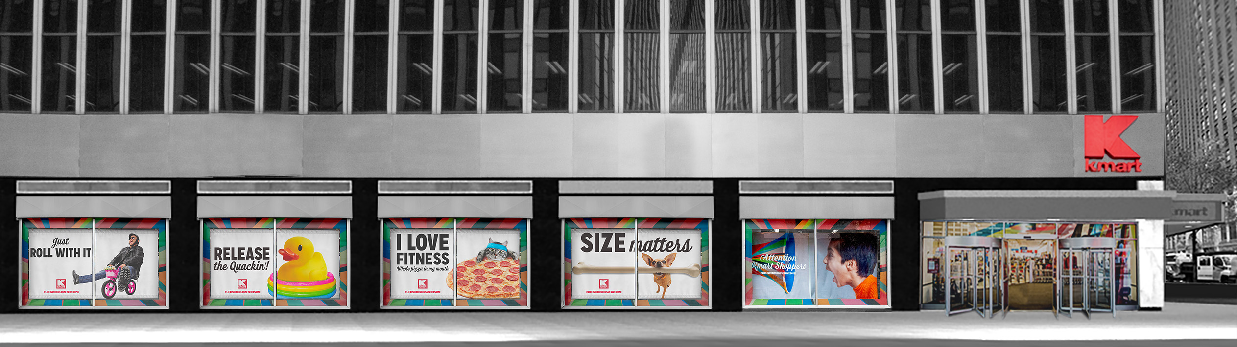
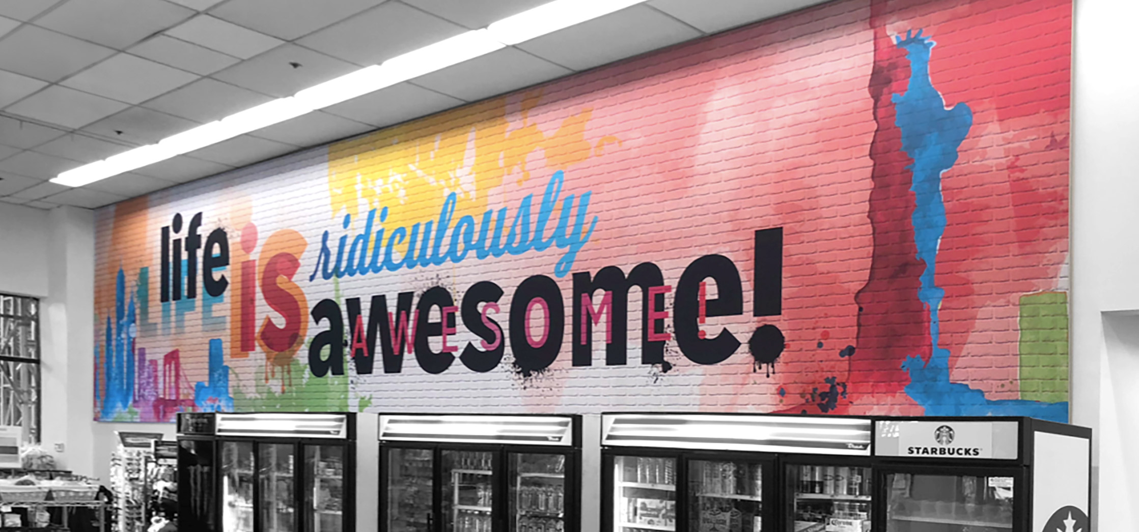

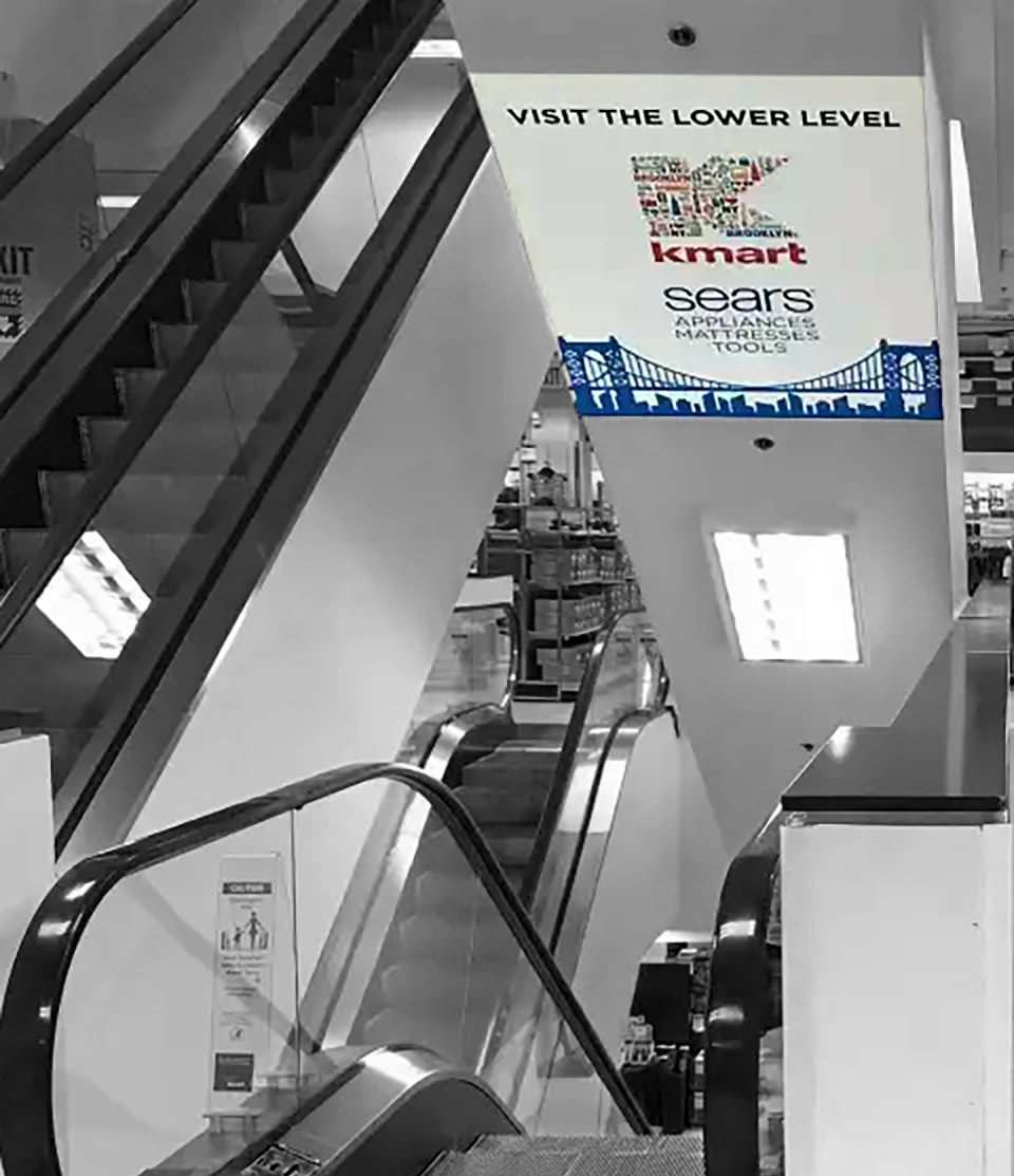
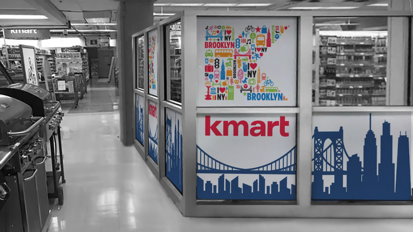
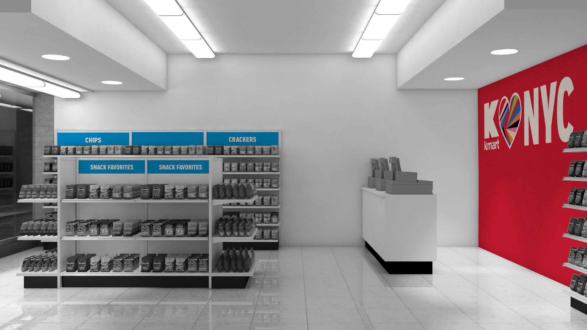
The defining look I established for the Brooklyn store was a colorful pattern made up of icons that define Brooklyn and New York. The colors used were pulled from the Kmart brand burst graphic. The "K" in the Kmart logo took on this pattern to create a unique look for the store signage.


The defining look I established for the Brooklyn store was a colorful pattern made up of icons that define Brooklyn and New York. The colors used were pulled from the Kmart brand burst graphic. The "K" in the Kmart logo took on this pattern to create a unique look for the store signage.

