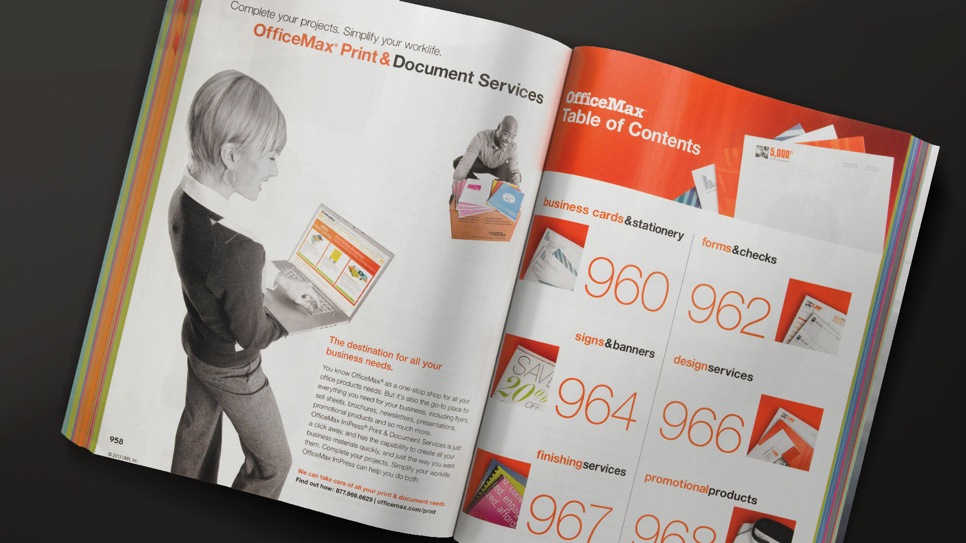
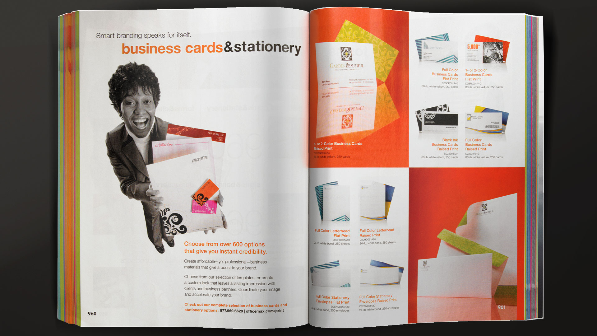
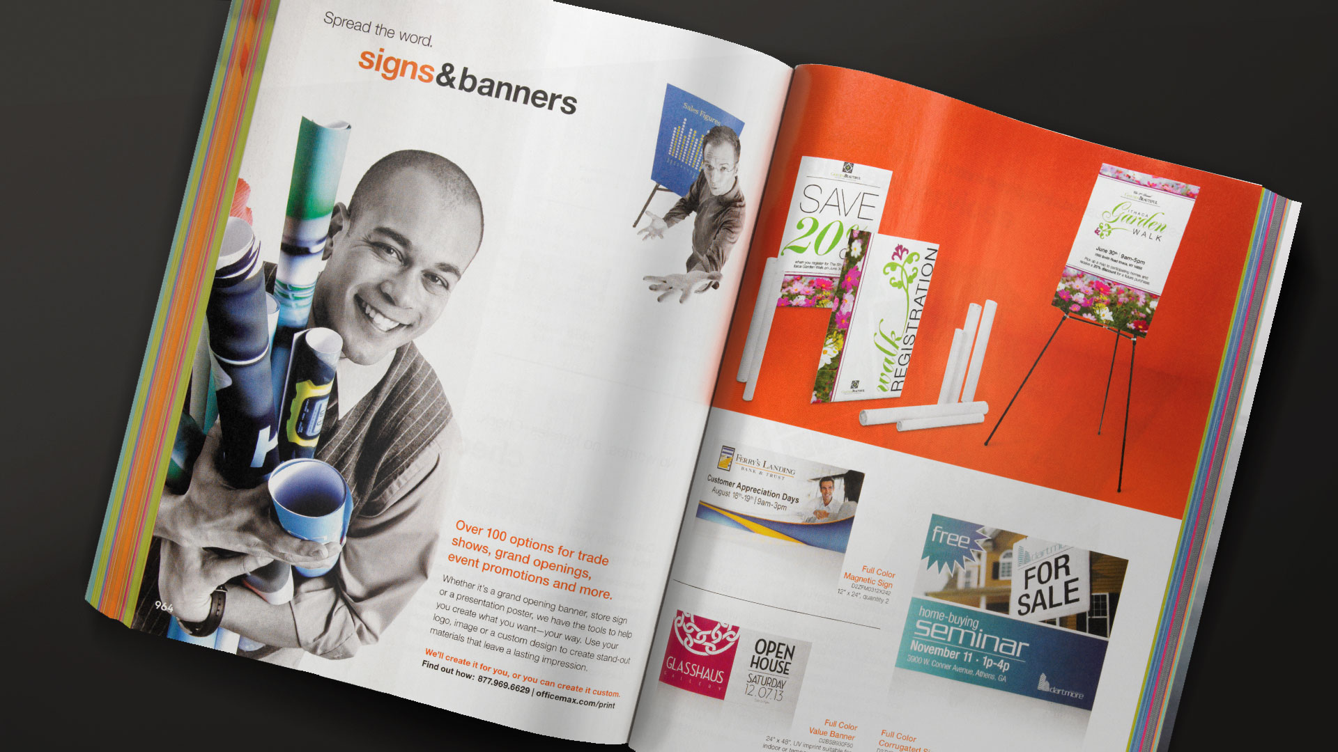
OfficeMax “Maxi” Catalog

DESIGN

Each year, OfficeMax would release the full product catalog created for businesses to order supplies from. Internally, we would call this the "Maxi" catalog. It was quite the beast, with it being over a thousand pages. My role was to design the overaching theme for the catalog, as well as, the section lead-in pages and photography direction. The interior product pages were built-out by our production design department.
The design incorporates a bright energetic palette supported by dynamic photography made to feel as though the products are coming out of the pages towards the viewer. The idea was to bring a new energy to everyday supply items.

TEAM

Interior Concept, Design – Jenna West
Copy – Hillary Lichtenstein
Photographer – Dan Czempinski
Photo Direction – Jenna West
Design Manager – Christopher Scroggins
Creative Director – Durriya Gunja

OfficeMax “Maxi” Catalog

DESIGN

My role was to design the overaching theme for the catalog, as well as, the section lead-in pages and photography direction. The interior product pages were built-out by our production design department.
The design incorporates a bright energetic palette supported by dynamic photography made to feel as though the products are coming out of the pages towards the viewer. The idea was to bring a new energy to everyday supply items.

TEAM

Interior Concept, Design – Jenna West
Copy – Hillary Lichtenstein
Photographer – Dan Czempinski
Photo Direction – Jenna West
Design Manager – Christopher Scroggins
Creative Director – Durriya Gunja

My sketches for the page templates varied, but the dimensional elements helped the 3D square concept stand out from all the others. From that idea the concept for the lead-in pages was formed and brought new challenges for our photographer to make office products feel dynamic with forced perspective.

As part of a graphic refresh, layered squares became a common treatment within the Officemax brand. The 2013 catalog design was grounded in repetitive square elements, while incorporating the primary brand color – orange.

OfficeMax Maxi Catalog Lead-in Section Concept-Final
OfficeMax Maxi Catalog Page Template Concept-Final

As part of a graphic refresh, layered squares became a common treatment within the Officemax brand. The 2013 catalog design was grounded in repetitive square elements, while incorporating the primary brand color – orange.

OfficeMax Maxi Catalog Lead-in Section Concept-Final

My sketches for the page templates varied, but the dimensional elements helped the 3D square concept stand out from all the others. From that idea the concept for the lead-in pages was formed and brought new challenges for our photographer to make office products feel dynamic with forced perspective.

LEAD-IN SECTION SPREADS

Each lead-in spread was custom designed to highlight top products chosen by stakeholders. I worked closely with the photographer to decide how best to shoot each product to ensure that the idea of forced perspective would work in the templated layout. Use the arrows to page-through each lead-in image below.