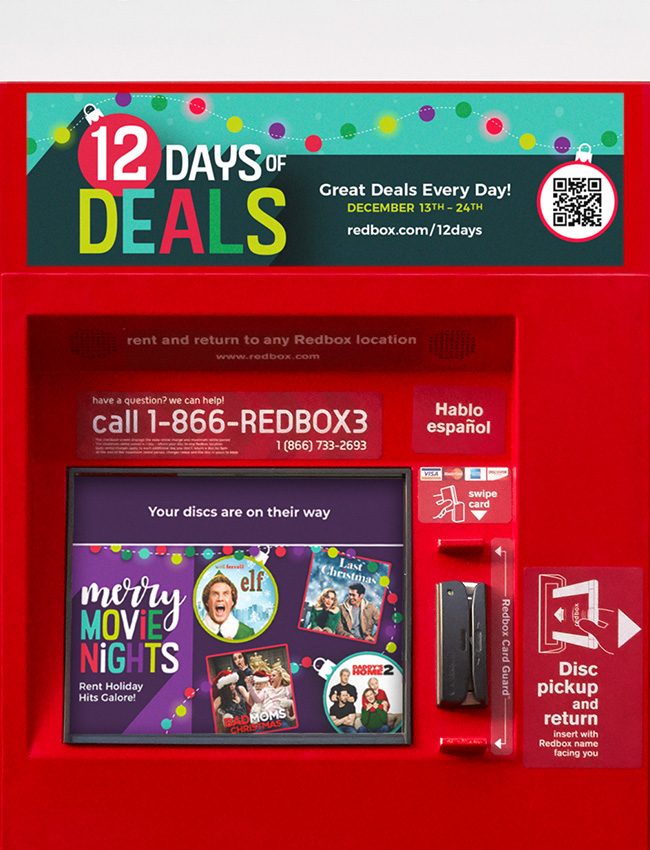
In 2020, the holiday season was quite different than the typical year. When designing this seasonal style guide, I wanted to combine bright colors with playful graphics to create a fun and lighthearted campaign that brightened the isolated feeling we were all experiencing at the time.
The holiday design was created to have the flexibility to form different, but cohesive looks to help individual marketing campaigns stand out while maintaining consistency within the overarching seasonal style. The graphics used were simplistic to contrast with the complexities found in the featured movie art. Redbox icons were used within the graphics to tie in the overall brand. The typography utilized playful ligatures in sans serif contrasted by whimsical script united by a bold long shadow.
Concept, Design & Direction – Jenna West
Copy – Nate DeLeon, Jen West
Developer – Ameya Athalye
ECD – Durriya Gunja
Stakeholders – Maura Gray, Jeanette Socke
Production – Matt Goodman, Billy Hamilton
Concept, Design & Direction – Jenna West
Copy – Nate DeLeon, Jen West
Developer – Ameya Athalye
ECD – Durriya Gunja
Stakeholders – Maura Gray, Jeanette Socke
Production – Matt Goodman, Billy Hamilton
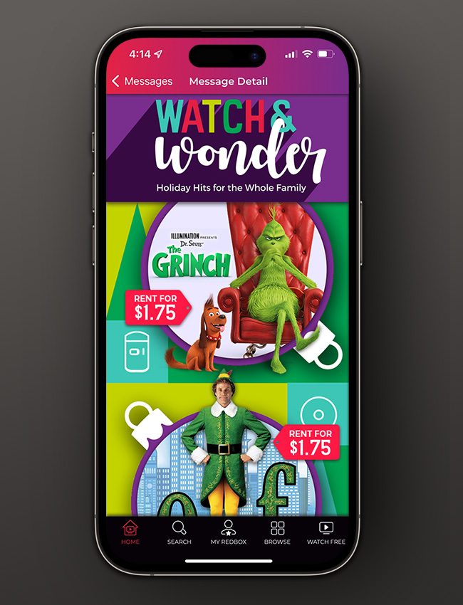
Bright colors and bold typography infuse a sense of excitement for the holiday season in this mobile push notification within the Redbox App. Movie art breaks the circle mask to add impact with a dose of whimsy and bright red tags highlight what Redbox is known for – movie nights for less.
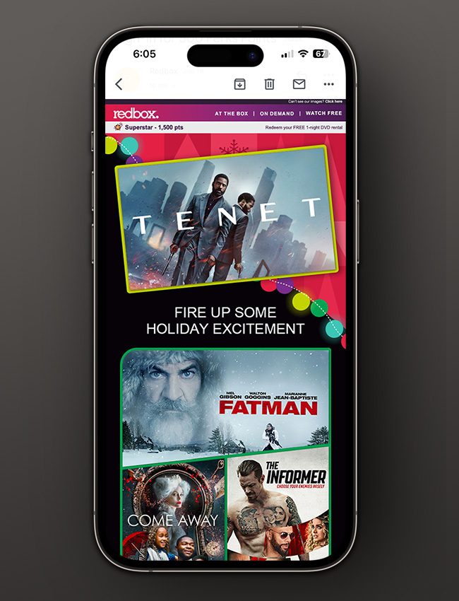


Redbox e-mails are strictly templated for the weekly-sends. The holiday graphics were designed to be flexible enough to be used within the templates and still maintain the festively fun look of the overall holiday campaign.
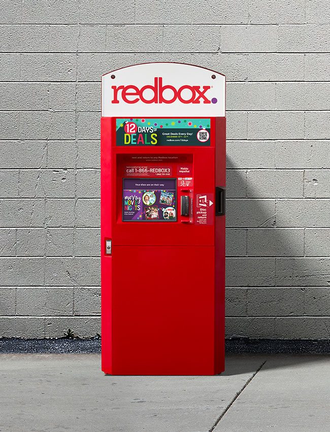

The use of a dark background on the Kiosk screen allows the bright movie art to stand out and be easily seen, while the text is large enough to be read comfortably from a reasonable distance. There is always the challenge that the screen itself has lower resolution and depending on natural light the screen contrast may change.

The use of a dark background on the Kiosk screen allows the bright movie art to stand out and be easily seen, while the text is large enough to be read comfortably from a reasonable distance. There is always the challenge that the screen itself has lower resolution and depending on natural light the screen contrast may change.
